
 On reddit, G7TAO asked, “Is there an open source/royalty free diamond symbol logo for amateur radio?” What he was looking for is a symbol, much like the ARRL logo (right), but more generic.
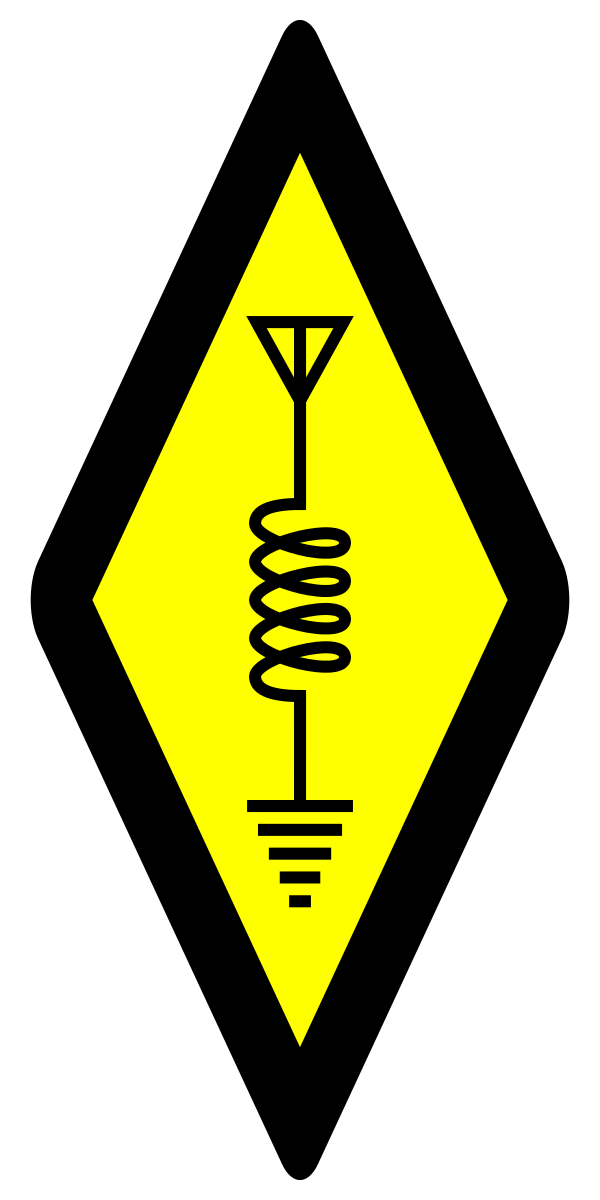 W2XG replied, “You mean the International Amateur Radio Symbol (left, click to get a larger image)? The artist released this SVG to the public domain.”
/u/hamsterdave commented, “Huh. I never realized that so many organizational logos are similar because they are derived directly from that symbol. Cool!”
To which, I replied, “The reason that so many logos are similar is because they all patterned their logos on the ARRL logo. I don’t know if the ARRL ever registered their logo as a trademark, or if they have maintained the trademark over the years, but if so, I think that they’d probably have a case if they decided to exert their rights over that trademark.”
Having said that, doesn’t that logo seem a bit quaint? I’ve contacted the ARRL to see when it was first introduced, but I’m guessing that it was in the 1930s, if not earlier. Shouldn’t we have a more modern icon?
It would be interesting to dig into the history of that logo.
There are others that are similar, but not quite the same. Scouts Australia has a badge (patch) for amateur radio operators with the same ground symbol but a different antenna symbol, plus a Scout fleur di lis in the middle. I think it is a nice looking patch.
http://collaroyplateauscouts.org.au/what-is-scouting/scouts/scout-award-scheme/
The RSGB logo is more like the Australian than the US logo.
https://rsgb.org/main/rsgb_logo_2016_no_border/
The RAC logo is more like the US.
https://wp.rac.ca/downloads/
The international logo for Radio Scouting is completely different with headphones on a globe, lightning bolts, and the World Scouting fleur de lis and border.
https://radio-scouting.info/
I went to the source of all knowledge: qrz.com and found this discussion on the meaning of the logo:
https://forums.qrz.com/index.php?threads/the-rhombus-symbol.236347/
The symbols are all easily recognized and it’s a simple, timeless design. There are many things about the ARRL that need changing, but this is not one.
Interesting side note: search on the string “ham radio tattoo” and you’ll be surprised at some of the thing that turn up. Too late for some people to change their icons!
This page says it all about the form of the logo – hands down the world-wide favorite is the vertical elongated diamond
http://vp9kf.com/iaru_flags.htm
I particularly like these below, so I am wondering now if this isn’t a chicken/egg scenario?
http://vp9kf.com/society_logos/iarur2.png
http://vp9kf.com/society_logos/rsgb.png
http://vp9kf.com/society_logos/rcu.png
http://vp9kf.com/society_logos/ura.png
http://vp9kf.com/society_logos/cars.png
http://vp9kf.com/society_logos/ref.png
http://vp9kf.com/society_logos/crag.png
http://vp9kf.com/society_logos/eep.png
http://vp9kf.com/society_logos/macao.png
http://vp9kf.com/society_logos/marp.png
http://vp9kf.com/society_logos/frr.png
http://vp9kf.com/society_logos/karl.png
so many variations on a theme…
Search of the U.S. trademark database indicates that the ARRL did file to register its version of the diamond logo in 1965, with “first use in commerce” (a technical phrase) listed as 1920. The registration has since expired. However, that doesn’t necessarily mean ARRL currently has no rights with respect to its mark.
Because the ARRL needs more exclusive rights to things in Ham Radio?
I think not.
The ARRL diamond was created before 1925. It can be seen on these publications:
* https://commons.wikimedia.org/wiki/File:ARRL_OO_card-3APV-1925.jpg : OO card, 1925
* Radio Amateur’s Handbook 1926 (1st edition)